File:Fig. 6. Map on the left of Makueni County showing the percentage of population living below the average household wealth (light blue to white).png
From energypedia

Size of this preview: 800 × 469 pixels. Other resolutions: 320 × 188 pixels | 807 × 473 pixels.
Original file (807 × 473 pixels, file size: 320 KB, MIME type: image/png)
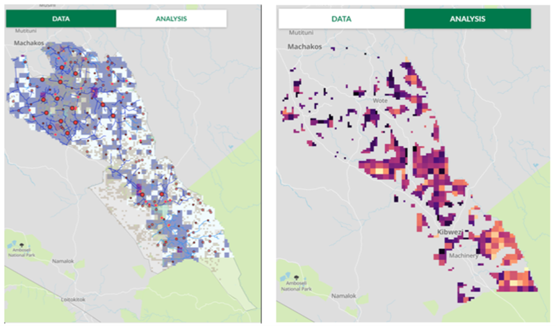
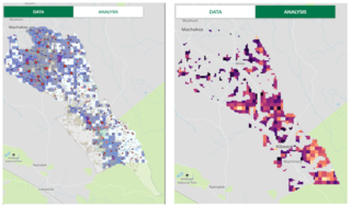
Fig. 6. Map on the left of Makueni County showing the percentage of population living below the average household wealth (light blue to white indicating higher poverty rates), croplands (grey), grid distribution lines (blue), markets (red) and agroprocessing facilities (pink). On the right are analysis results of the Makueni County datasets in the map on the left after filtering the map to display areas far away from the grid distribution lines, (>2km away), and with higher percentage of population living below the average household wealth
File history
Click on a date/time to view the file as it appeared at that time.
| Date/Time | Thumbnail | Dimensions | User | Comment | |
|---|---|---|---|---|---|
| current | 14:34, 16 May 2023 | | 807 × 473 (320 KB) | ***** (***** | *****) |
You cannot overwrite this file.


.png&oldid=409933)
.png)
.png&action=edit&redlink=1)
.png&action=edit)
.png&action=history)
.png)
.png)
.png&oldid=409933)
.png&action=info)
.png)